Brand Swag: Apple’s 50th Phone Case (fail)
Brand Swag: Apple’s 50th Anniversary Phone Case
Objective:
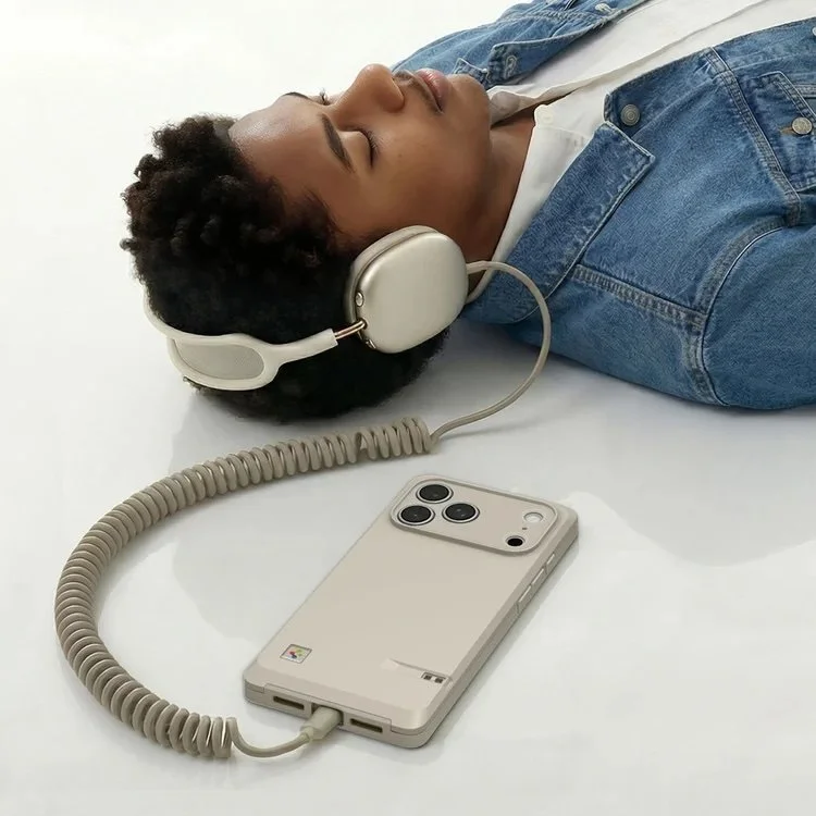
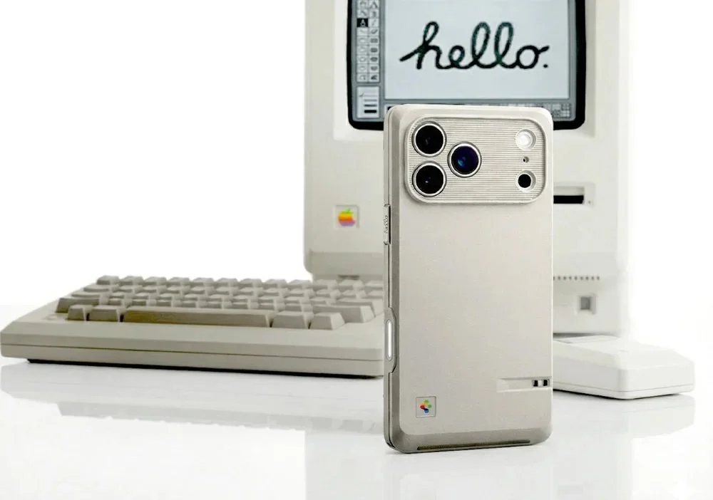
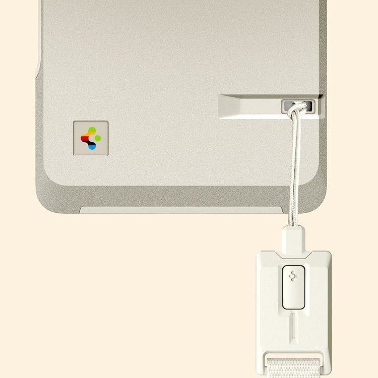
’The Limited Edition Classic LS, built for the iPhone 17 Pro and 17 Pro Max, takes direct visual cues from Apple’s original Macintosh 128K, the compact beige computer that helped define personal computing in the 1980s. Arriving in time for Apple’s 50th anniversary year, the case comes in a muted Stone beige that mirrors the plastic tones of early hardware. Its squared edges and slightly boxy shape echo the Macintosh silhouette, while details like ribbed lines on the back reference the look of a floppy disk slot.’
Why it flops:
There’s only one reason I think this flops, the logo, the most famous logo on earth, the infamous, original Apple logo. How do you build an entire campaign and phone case and NOT use the original rainbow apple. Boggles the mind. Seriously, you had ONE JOB. Everything else, the color, the shape, yea that’s all fine and good, it’s ordinary, nothing special there, but if you’re going to do an homage to nostalgia, then do it right, but my god, at least get that one distinguishing thing right. What a sad thing to see, Steve Jobs would be throwing this in the garbage and firing the designer who put this crap together. I’m disgusted.
Credit and images: https://community.designtaxi.com/topic/22033-for-apples-50th-your-iphone-17-pro-can-dress-like-its-first-macintosh/?utm_source=DT_Newsletter&utm_medium=DT_Newsletter&utm_campaign=DT_Newsletter_14012026&utm_term=DT_Newsletter_14012026&utm_content=DT_Newsletter_14012026&_bhlid=3ba989db9fe66c96a42ad83c721c95f806f98ea7